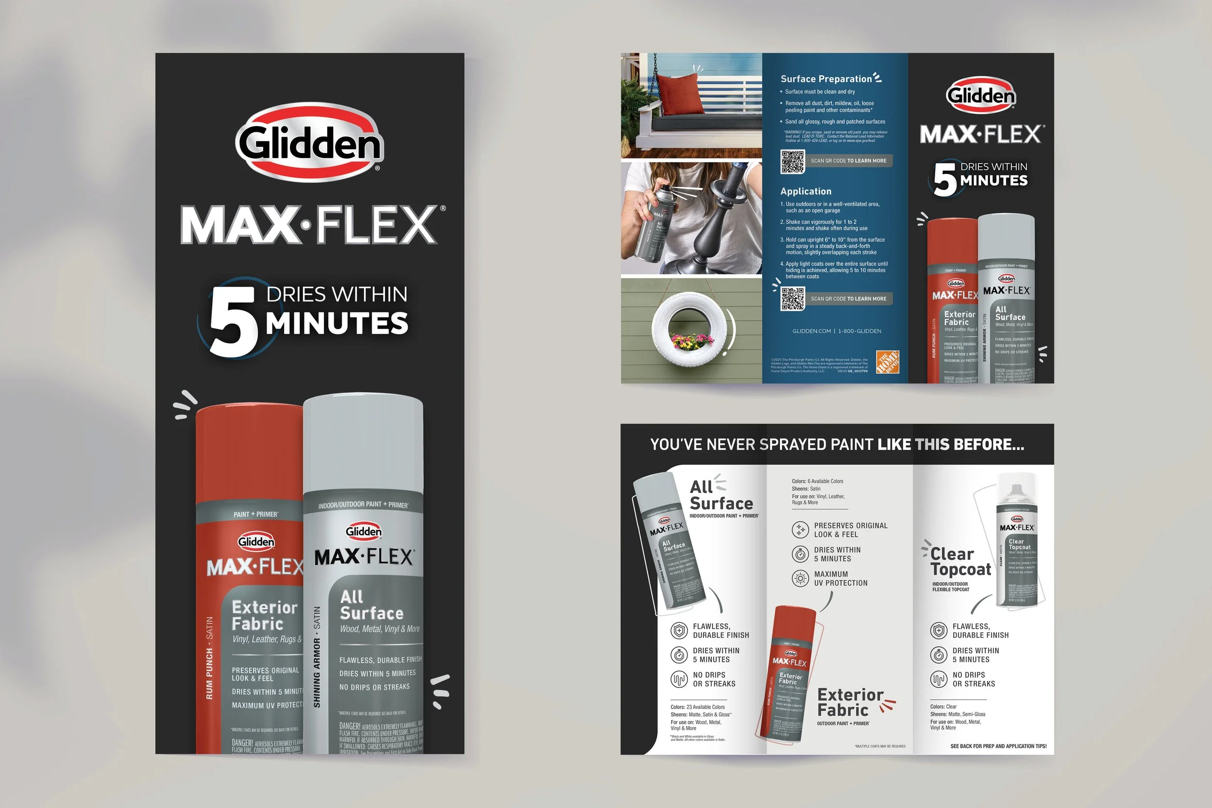
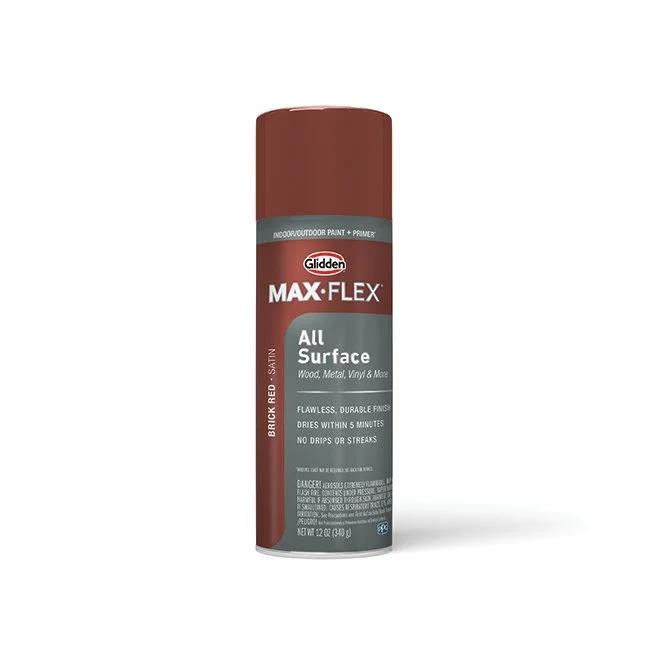
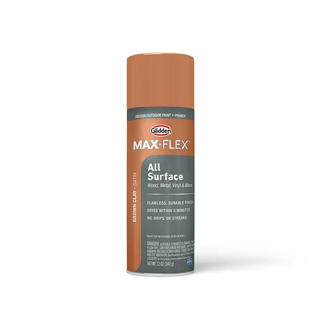
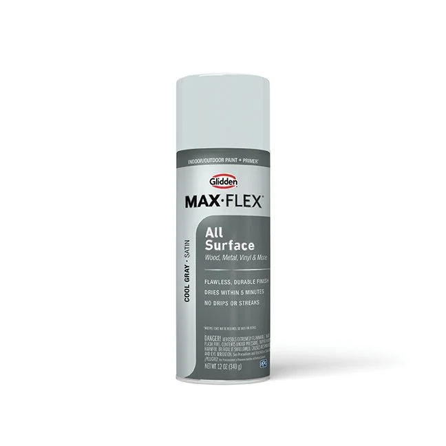
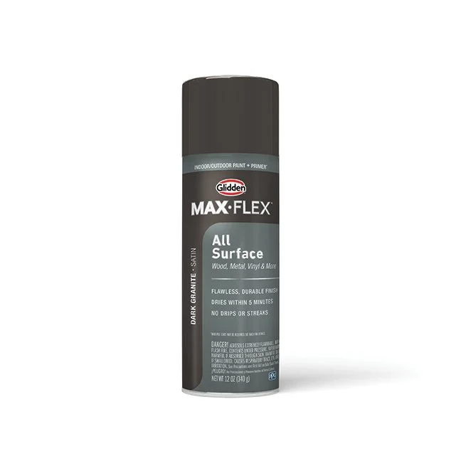
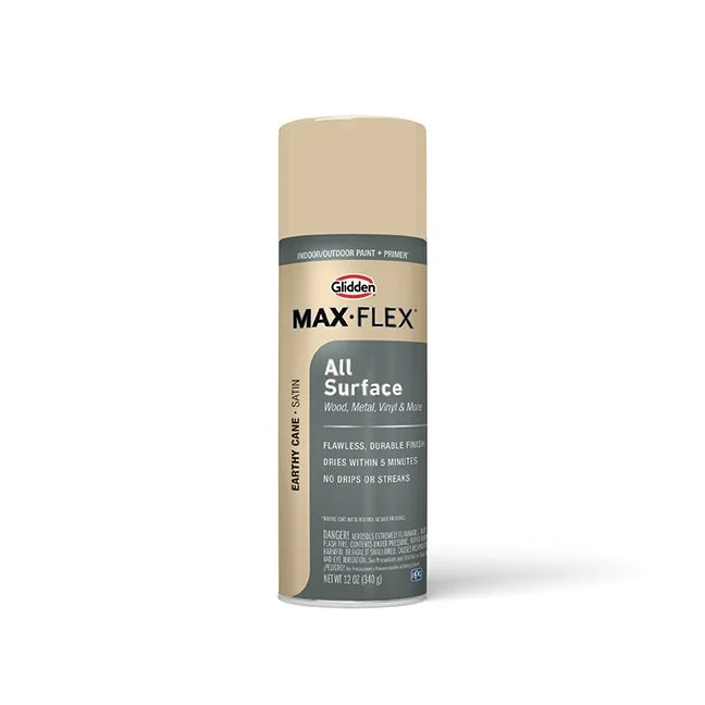
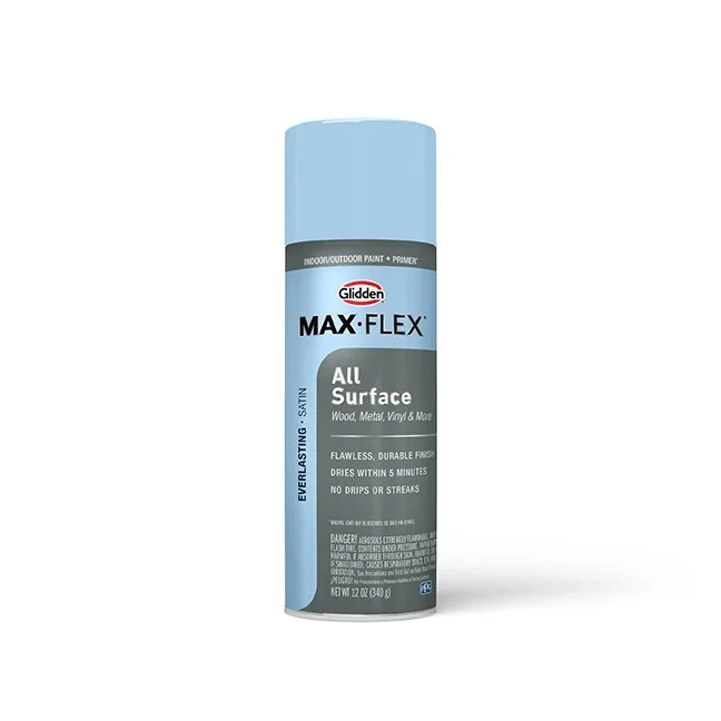
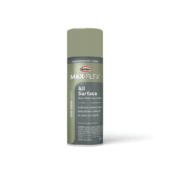
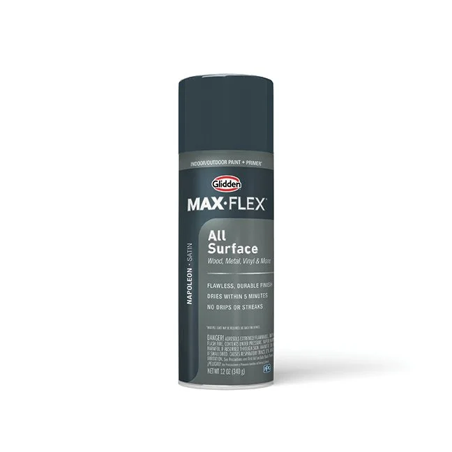
Glidden Max-Flex Label Re-design
The redesign goal for these labels was to create something easier to shop, elevate the price point, and showcase more color to instill consumer confidence.
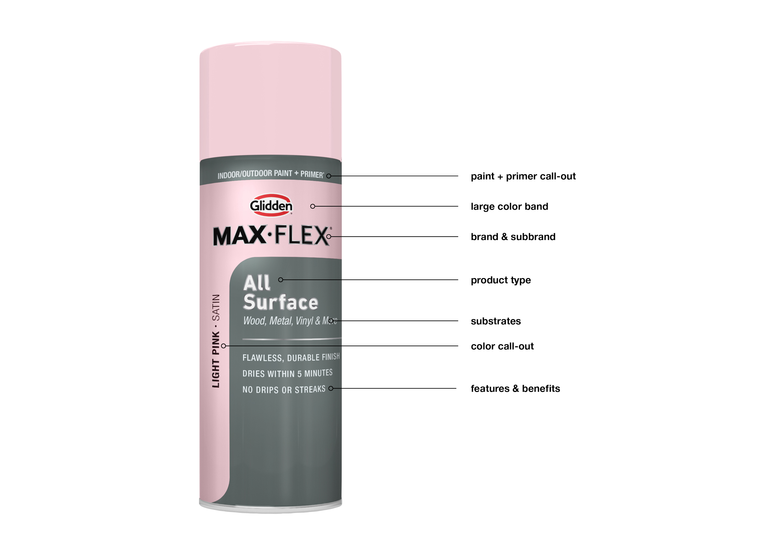
To achieve a higher-end persona I implemented a dark gray background and a clean, minimalist layout. Based on consumer insights, color confidence is lacking within the spray paint category. To combat the doubt, I increased the color call-out area and leveraged it as a design element. I also worked with the printer to color match all the labels to the spray paint caps in order to ensure an accurate color match
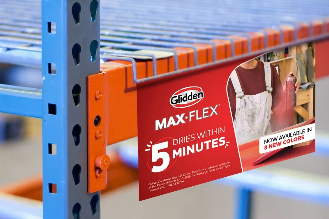
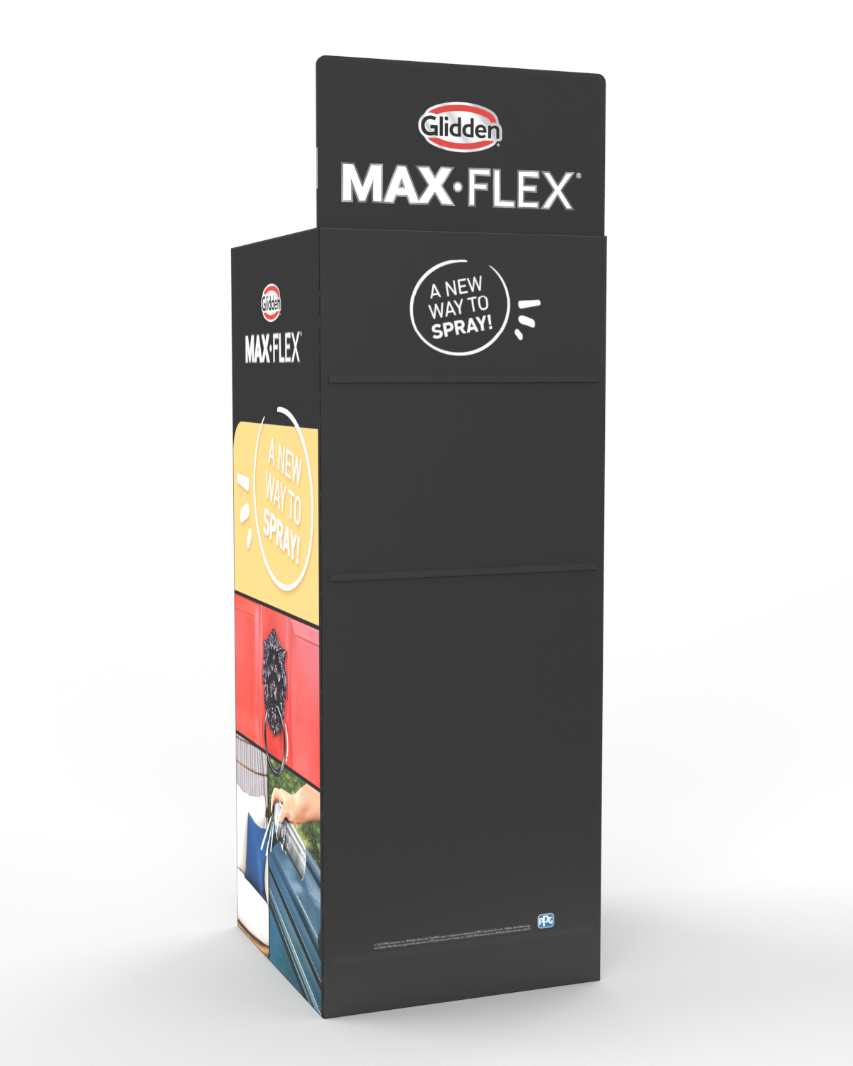
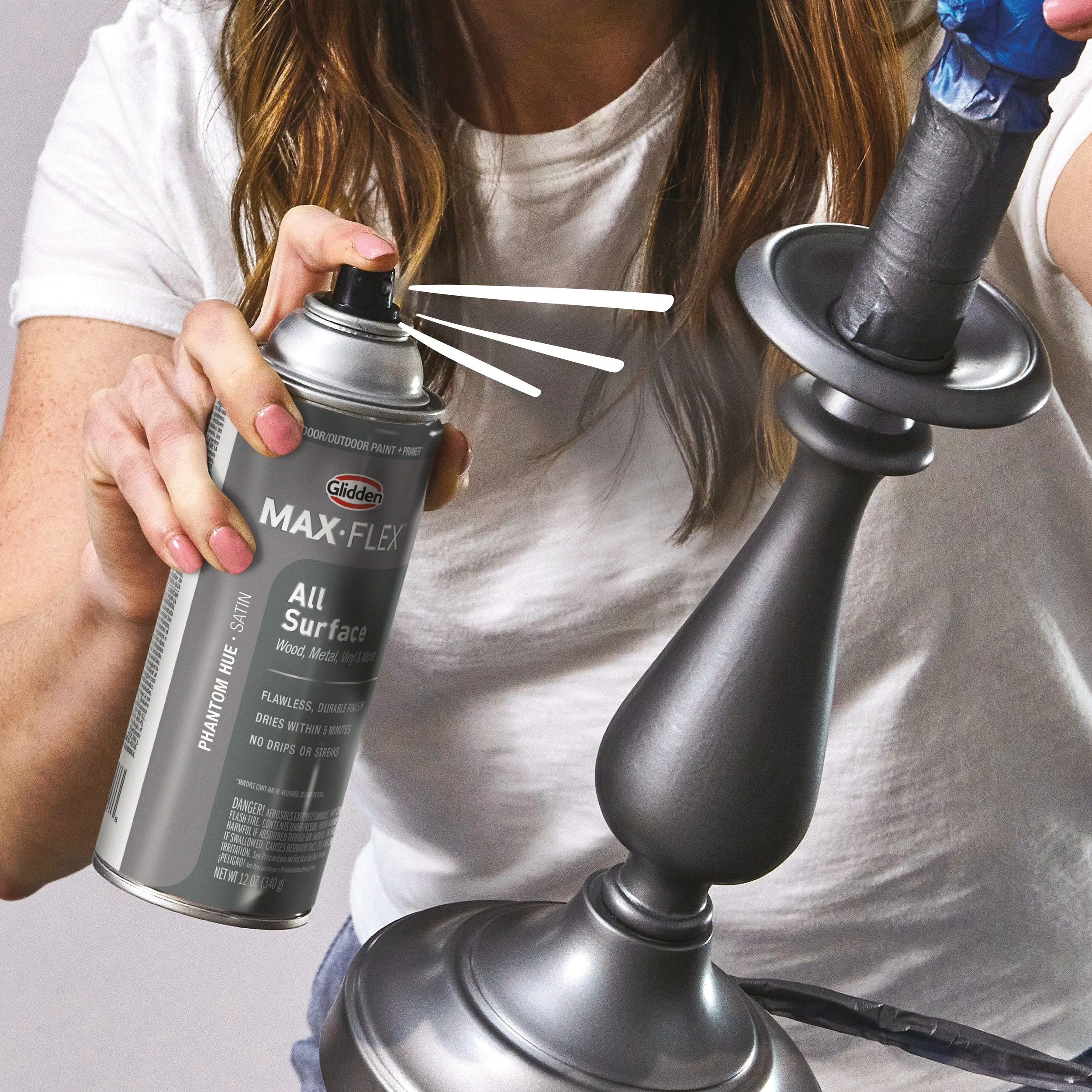
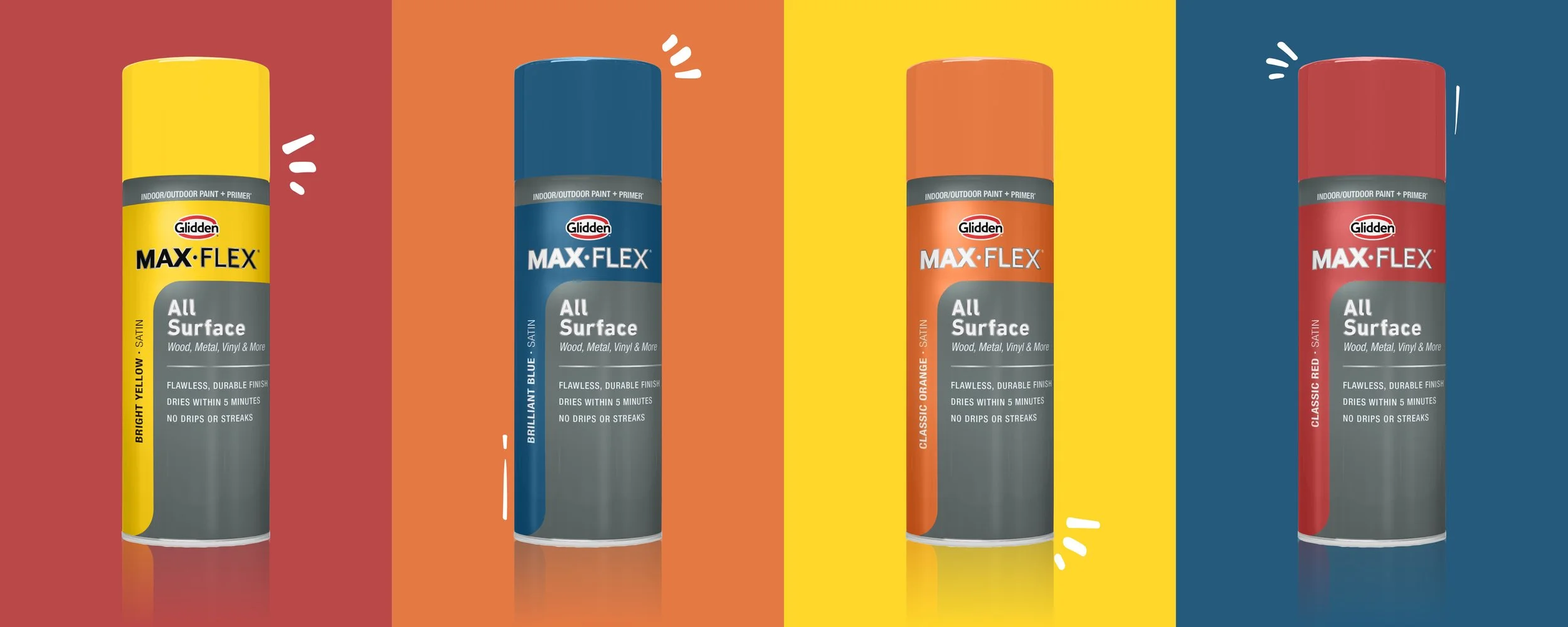
marketing activations
GLIDDEN is a tongue and cheek brand that keeps it real. Within the spray paint space we had more opportunity to add some playfulness to the brand which really showcases itself within the marketing materials.
Graphic illustration motifs highlight the imagery and paint cans, bringing motion to the pieces. Color blocking is also used to bring a pop to the design. below are marketing materials including a brochure, shelving signage, display, and digital eCommerce.