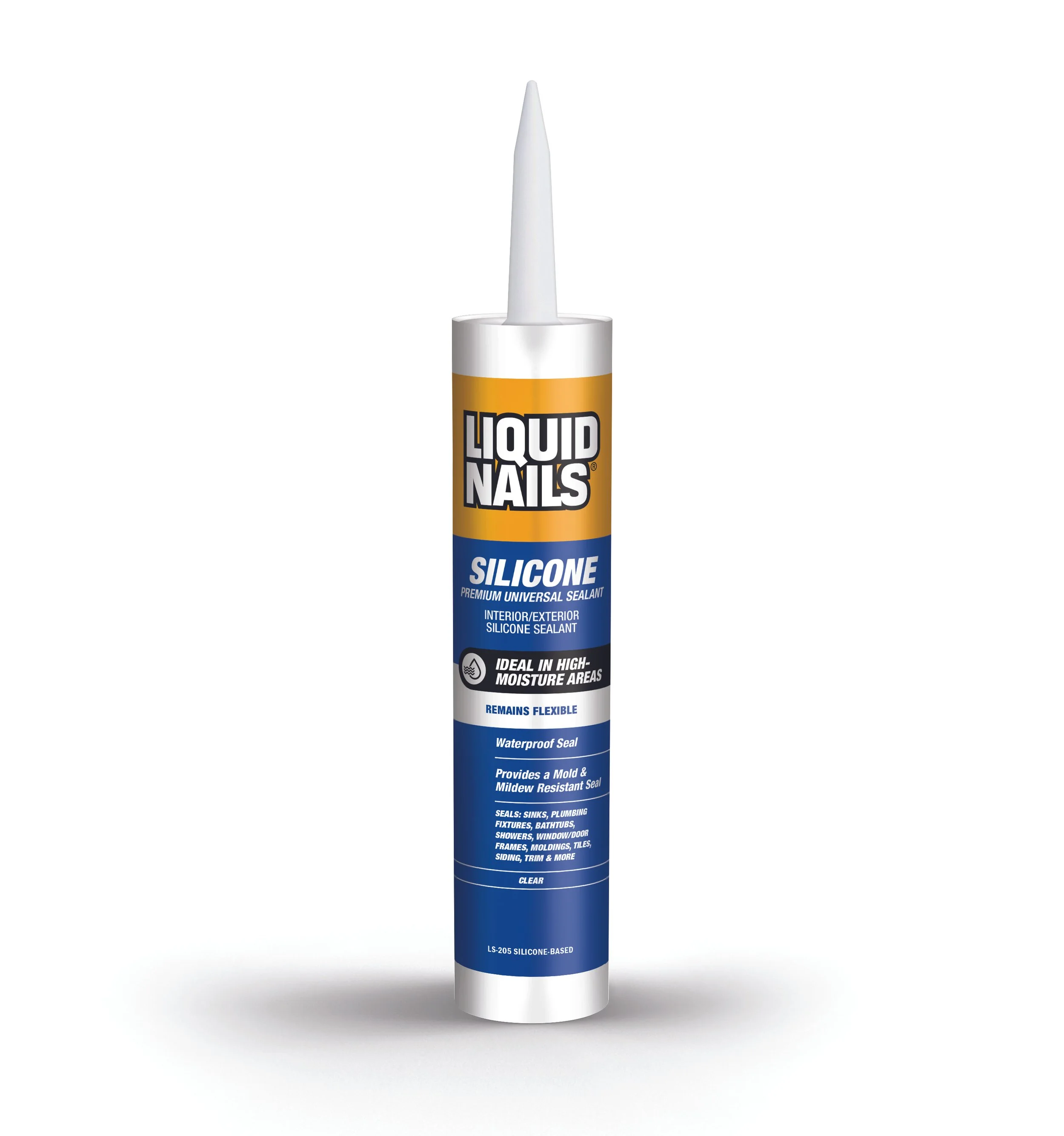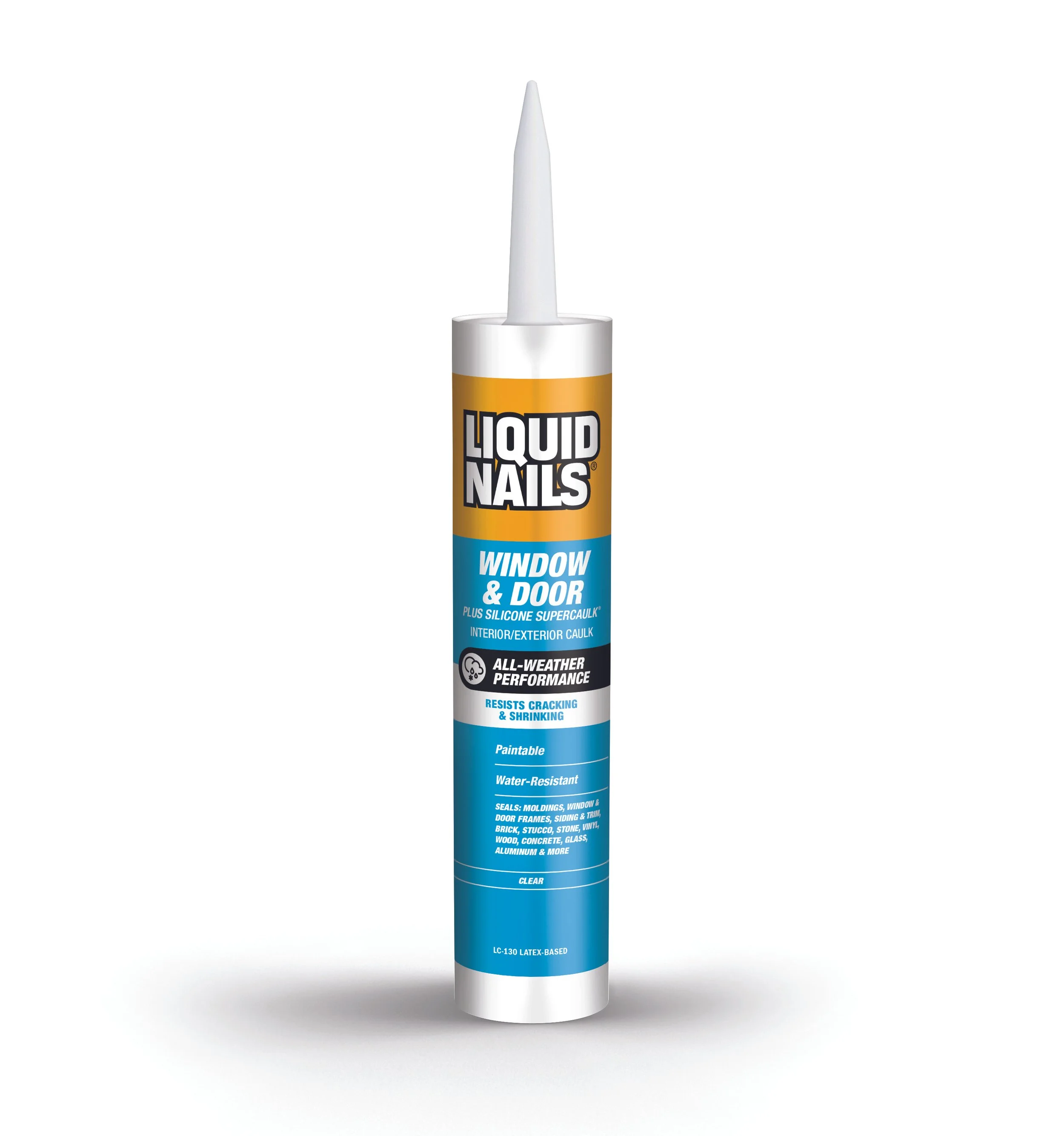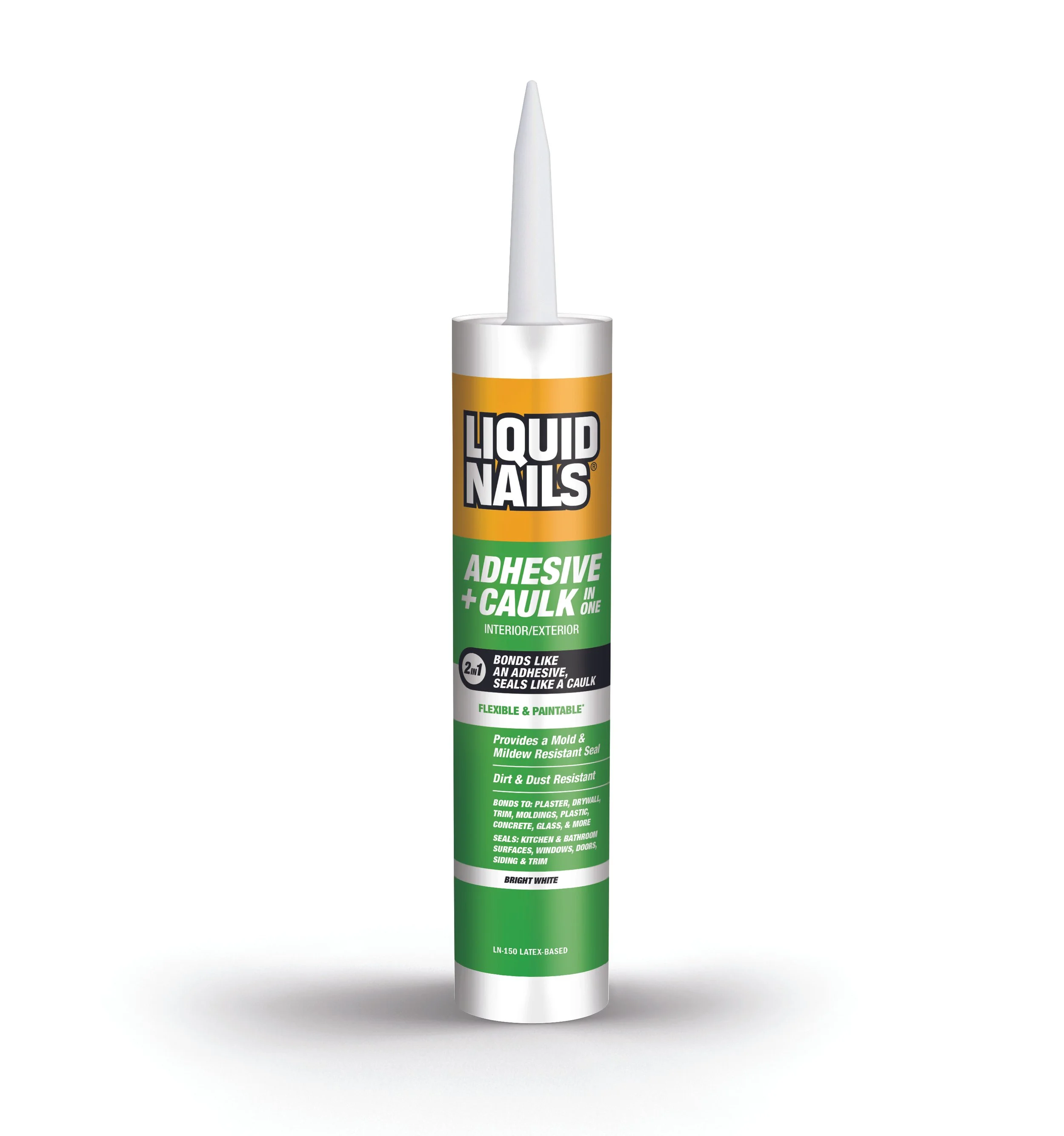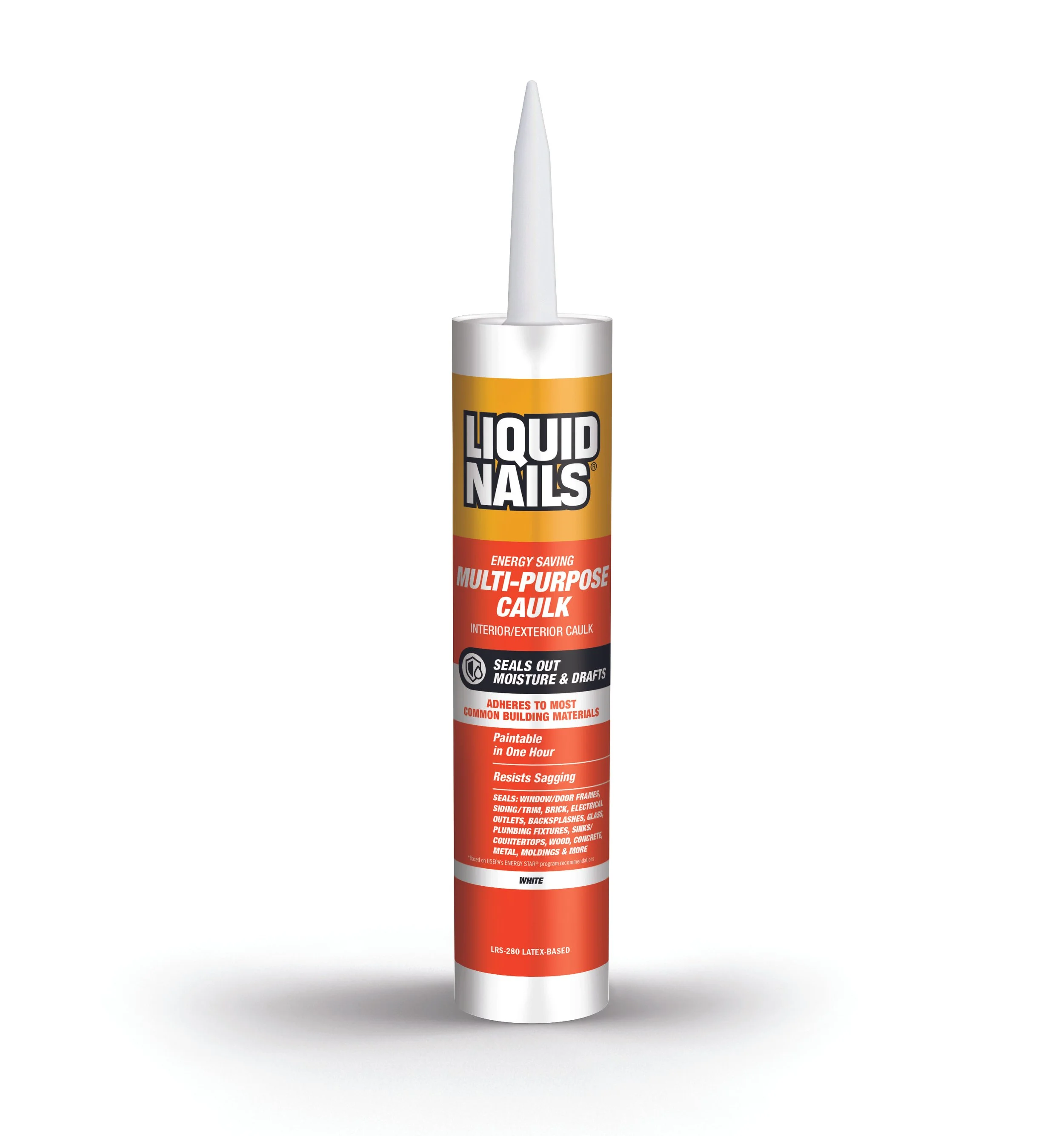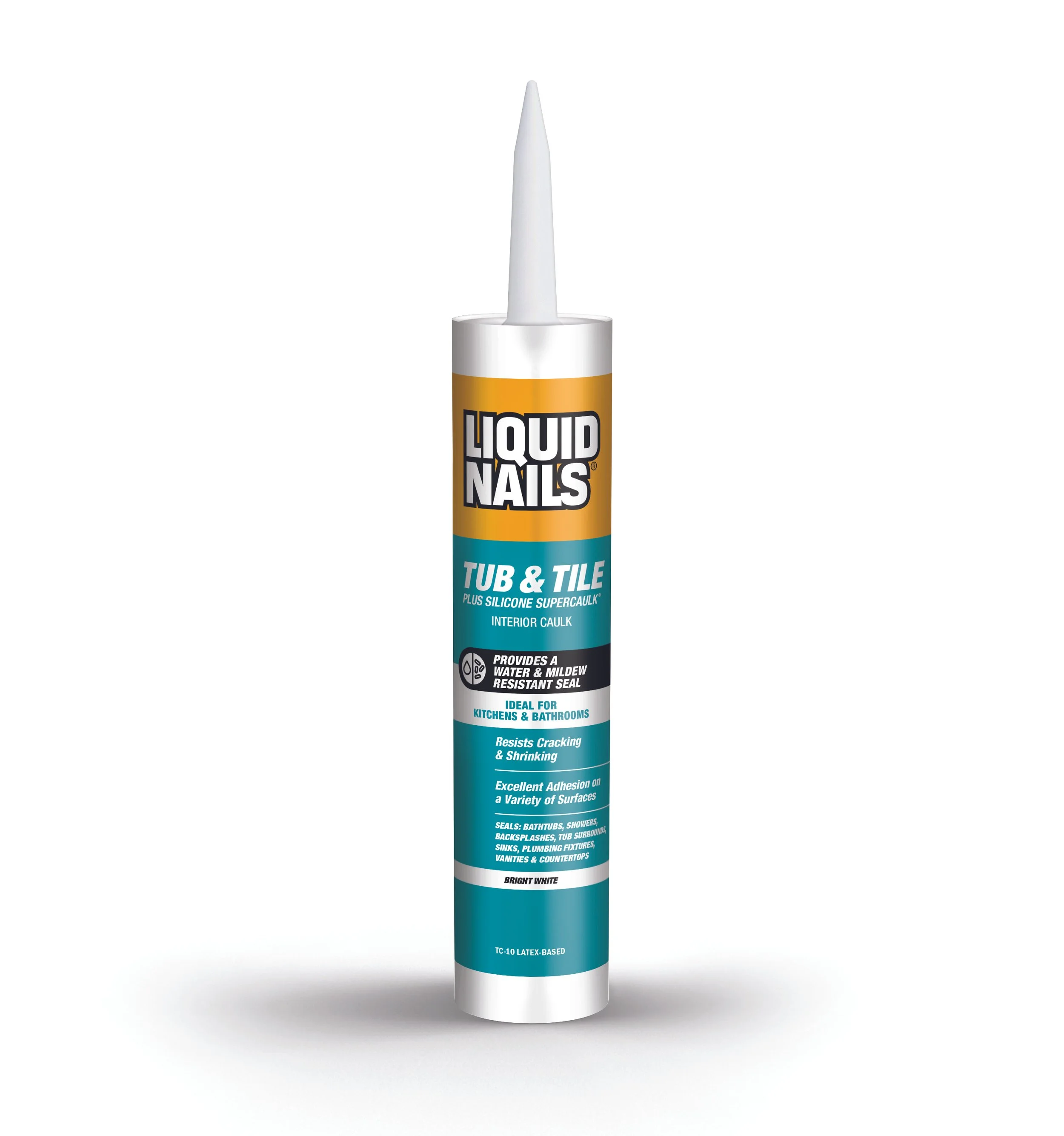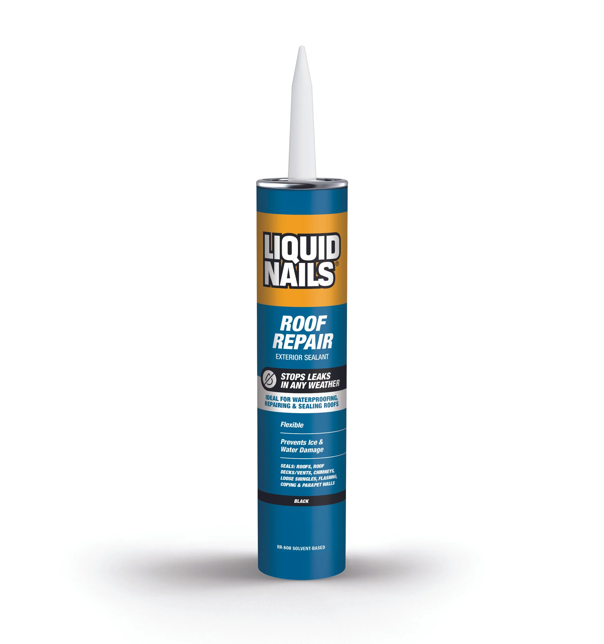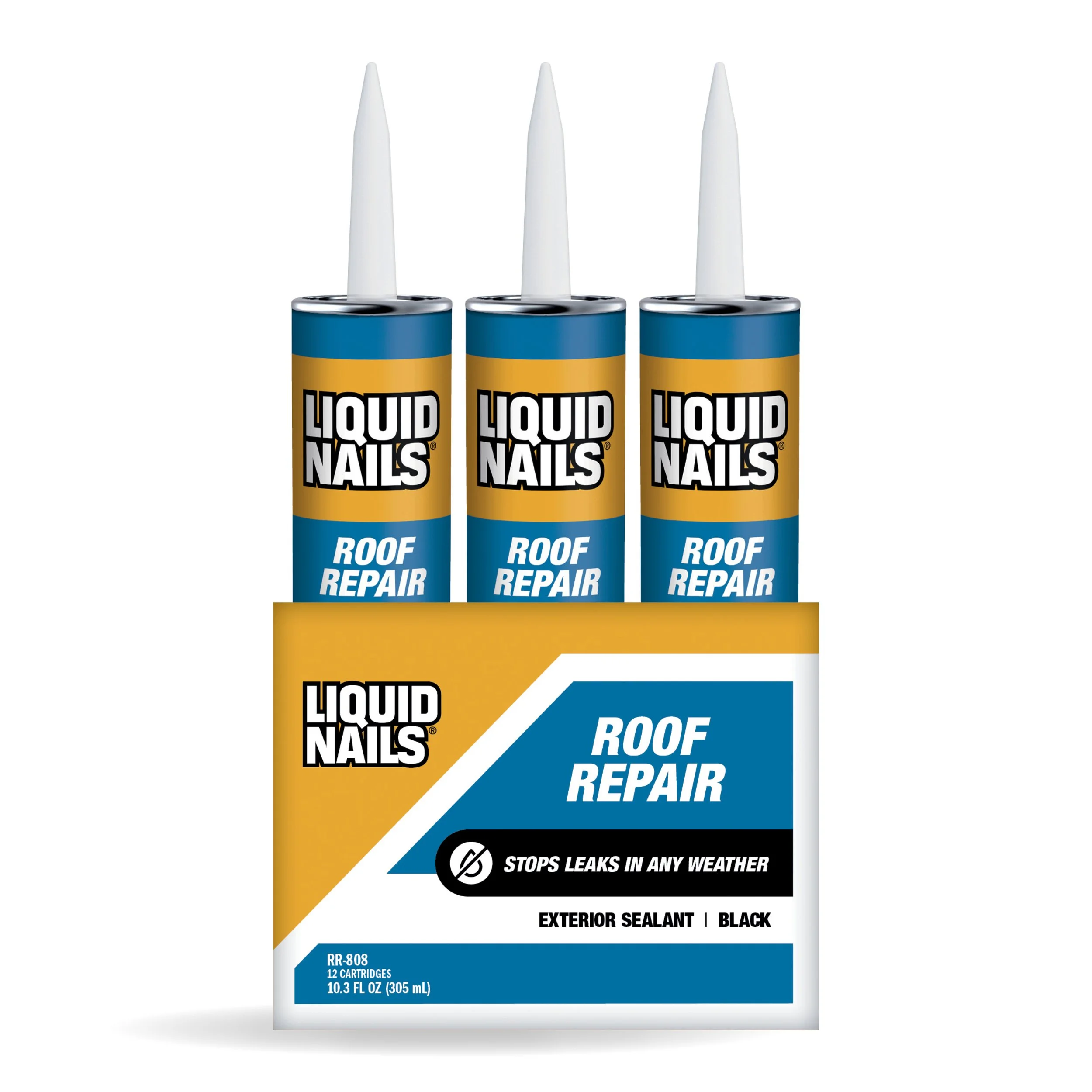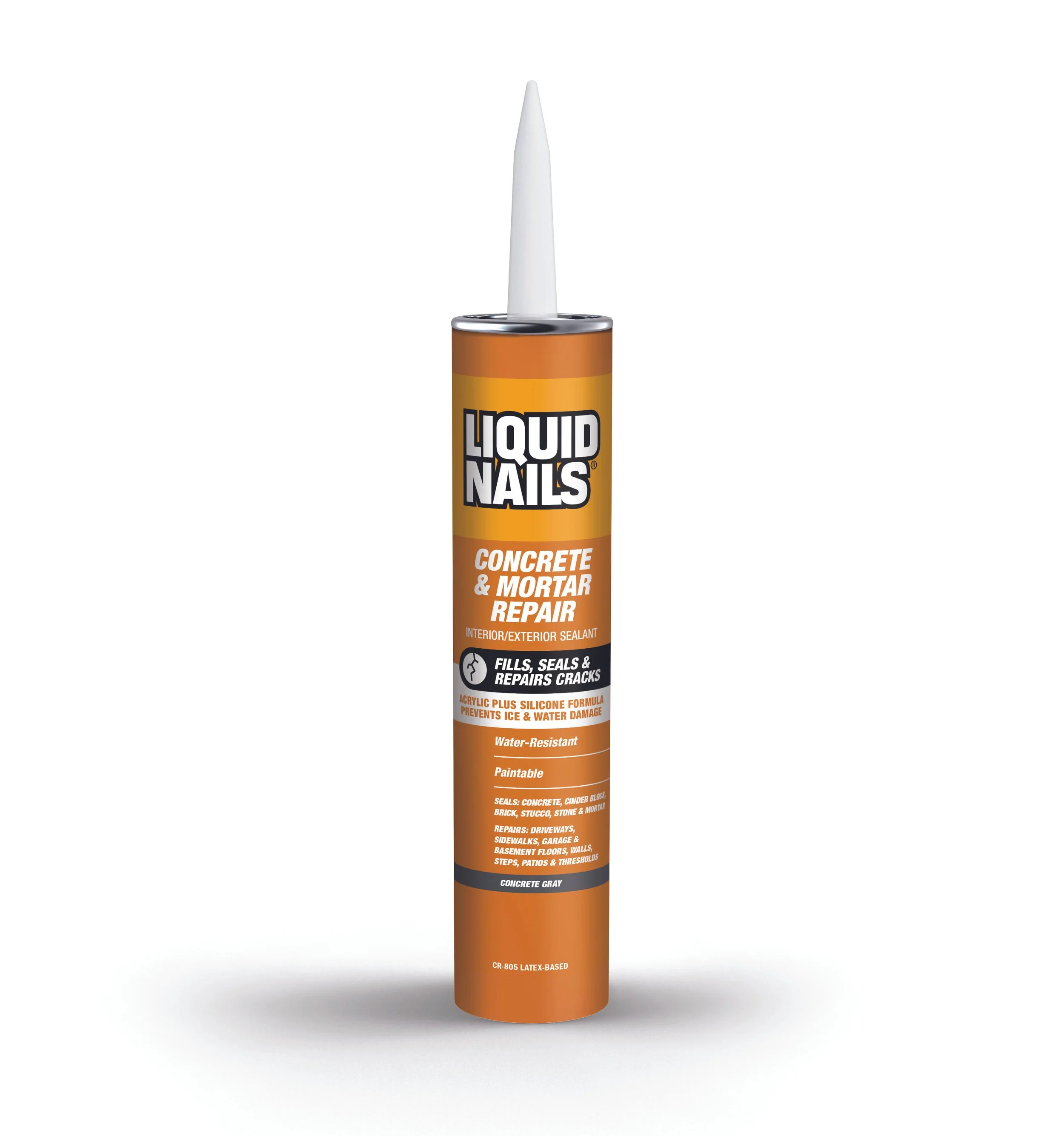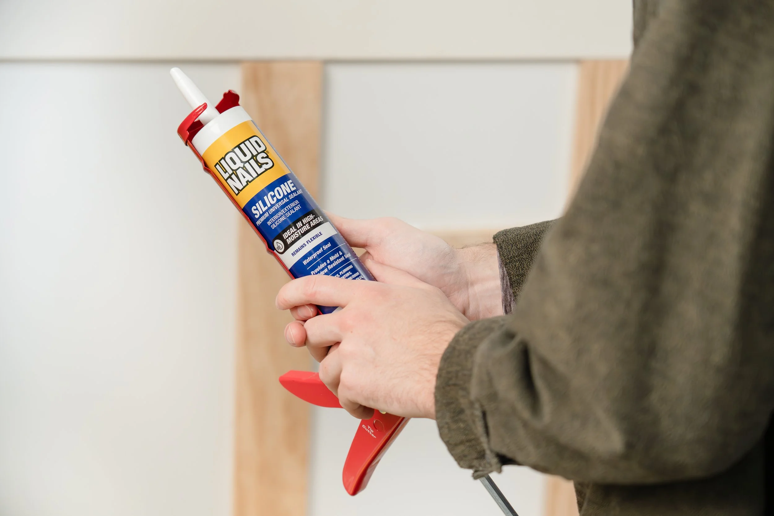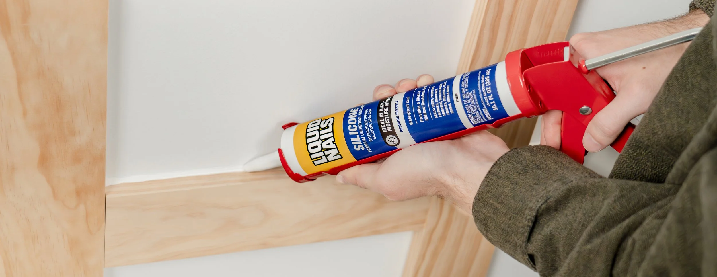
Liquid Nails
Caulks & Sealants Label Re-design
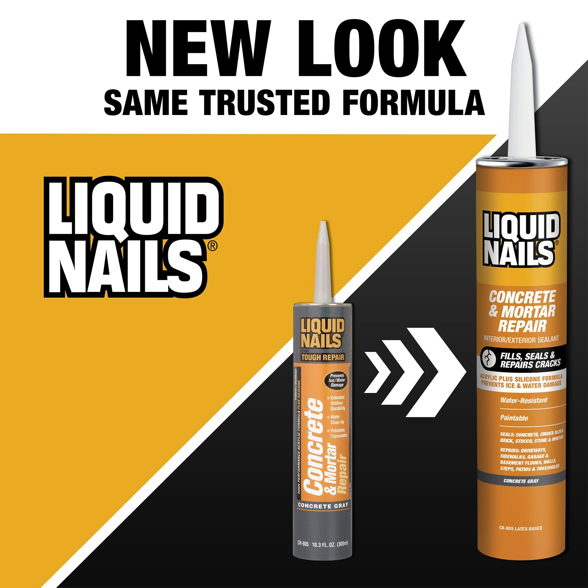
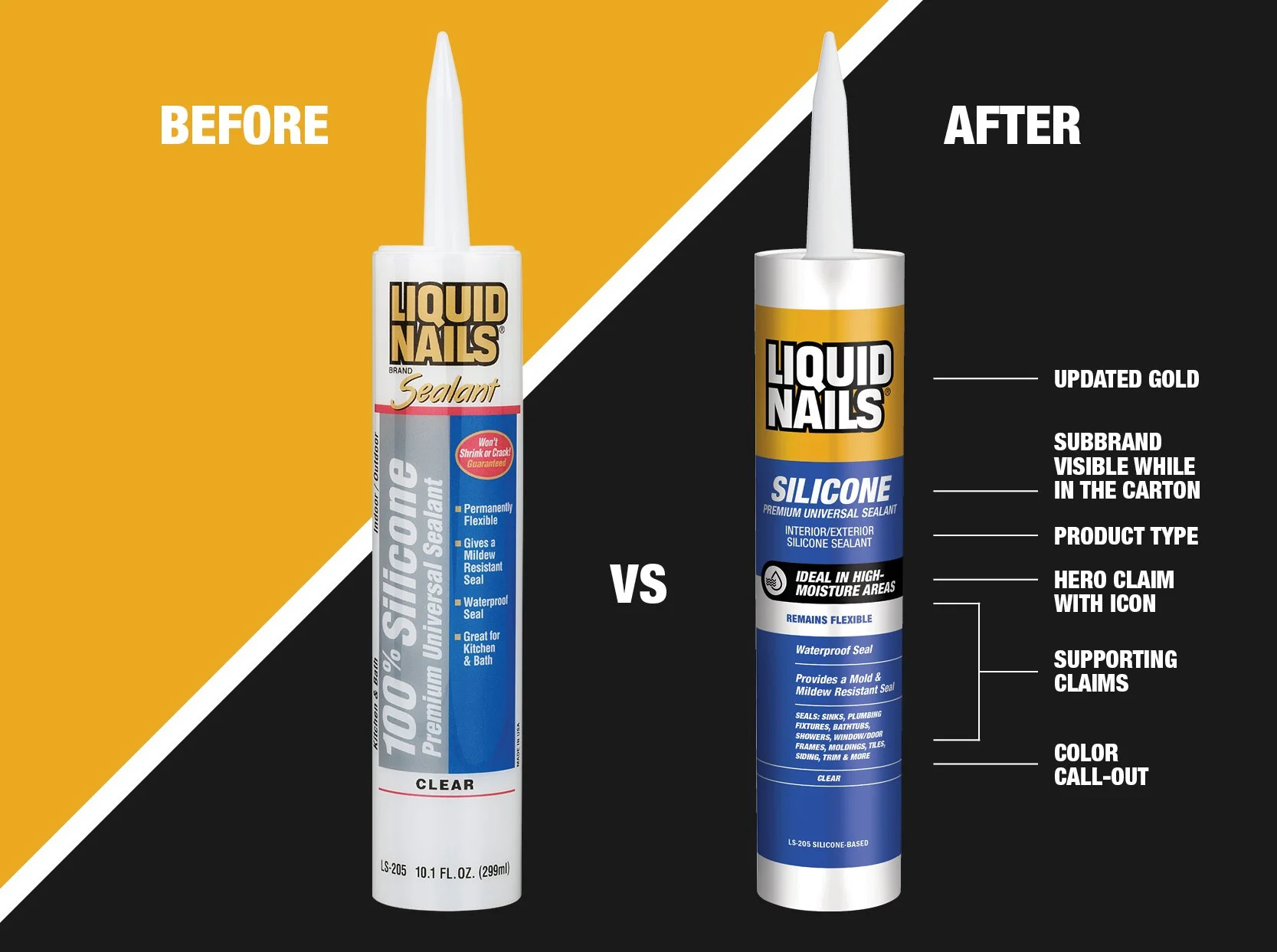
Liquid Nails is a brand that gets things done once and done right. In order to keep up with the brands strong, durable, and confident voice the packaging needed a refresh. The purpose of this refresh was to create a label with easier shoppability and a modern and durable look/feel that fits within our current adhesives family.
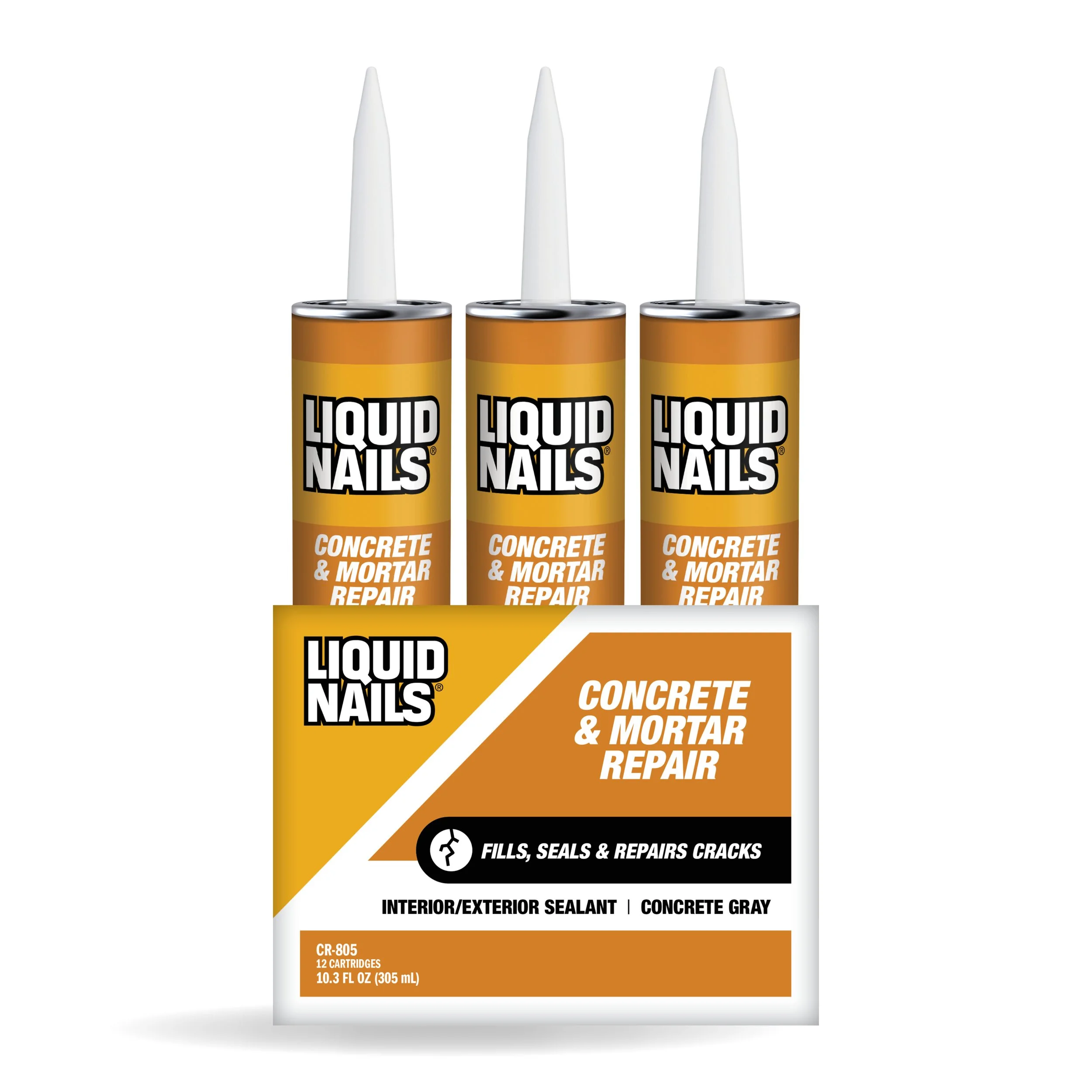
In order to increase the shoppability of the labels the Subbrand was moved up to the top of the label to allow visibility when sold in the carton pack. The layout was also simplified and a stronger hierarchy implemented to allow customers ease in finding information.
A clean structured layout re-enforces the durability and performance of this product. The amount of color on the label was enlarged to increase on shelf presence and black was added behind the hero claim to stand out draw the consumer eye.
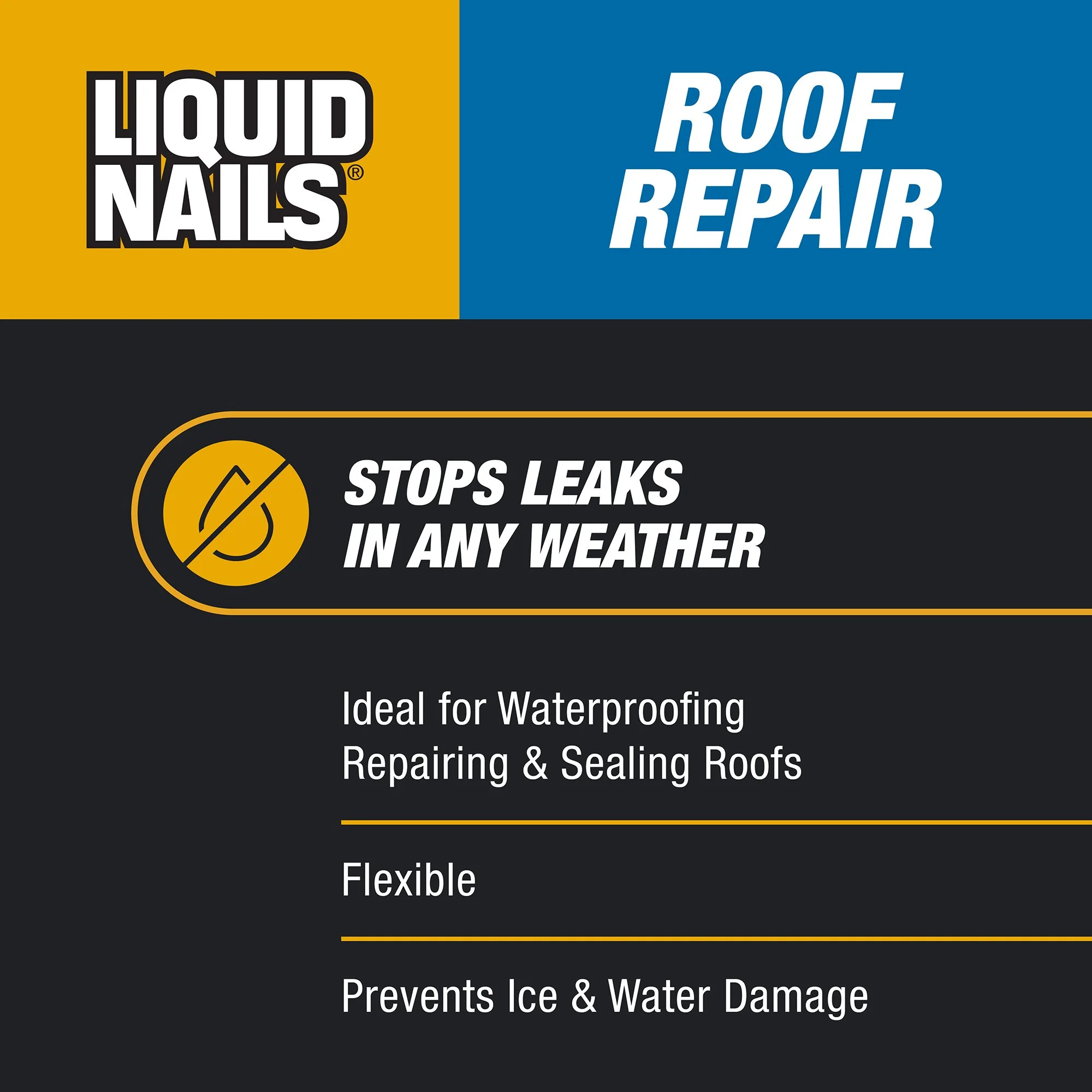
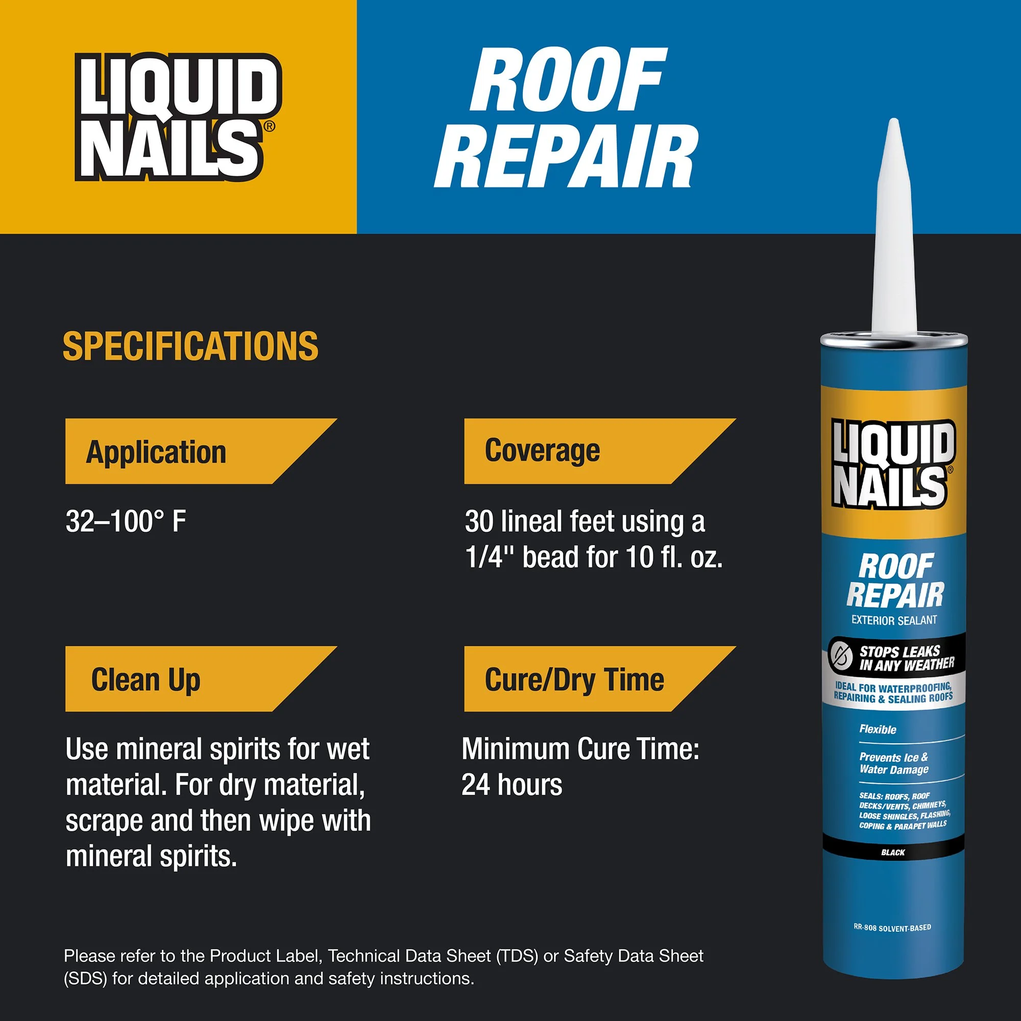
Liquid Nails Caulks & Sealants
within the Adhesives Family
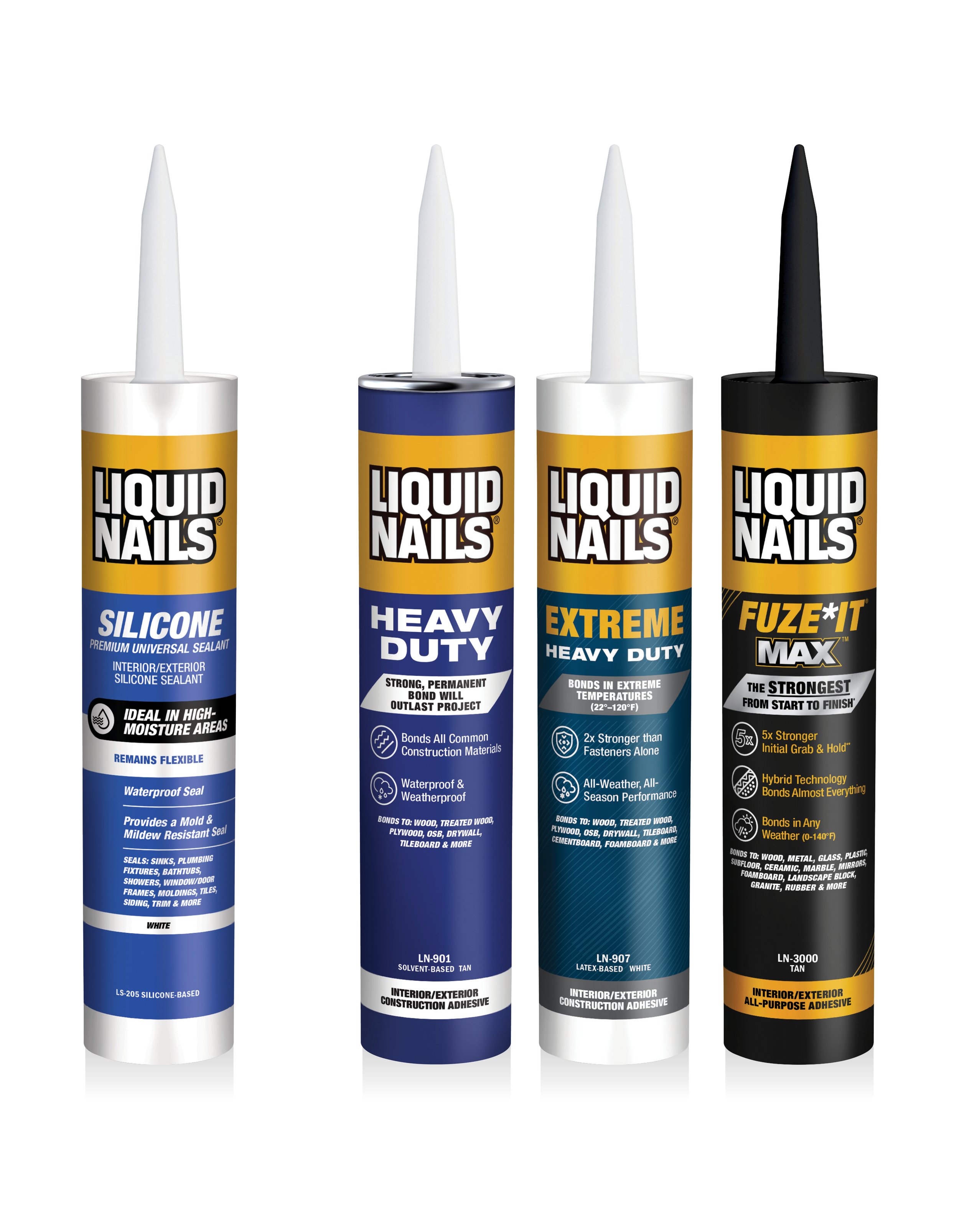
The challenge with these labels was to ensure they created a cohesive family with our adhesives assortment, while maintaining there own look and feel.
The overall label hierarchy and layout was leveraged from the adhesives assortment to keep a cohesive design, but the hero claim was given a separate shape and icon to differentiate the labels.
In addition, an italic type treatment was implemented on the Subbrand and features and benefits to nod to the original packaging. This also helps create a visual differentiator between the caulks & sealants and adhesive line-ups